Badge Design
Badge Design
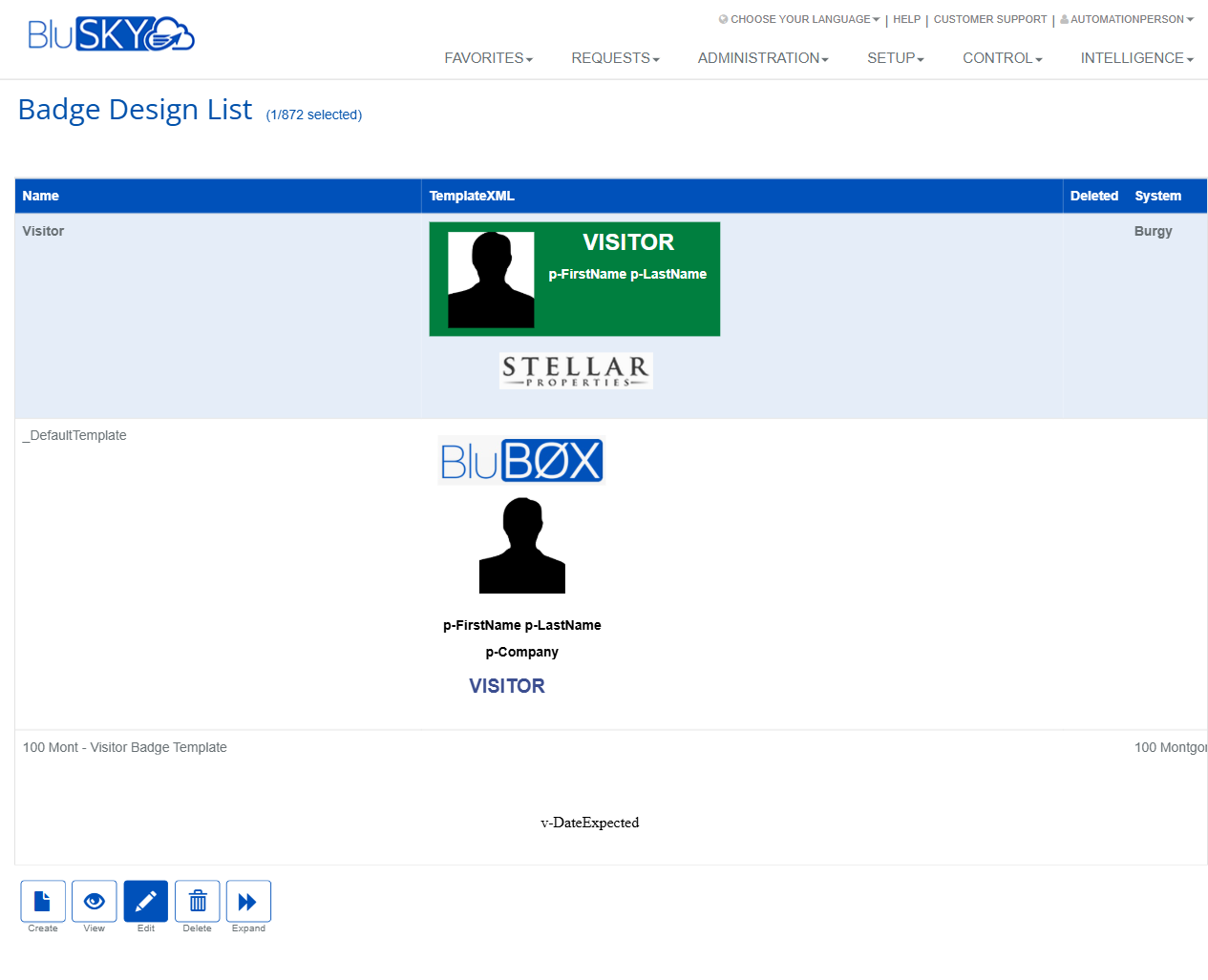
Screen Overview
The Badge Design pages allow administrators to create, preview, and manage printable badge layouts used for people and visitor workflows in BluSKY. The Badge Design List provides thumbnails for quick review and selection, while the Create Badge Design page includes a visual designer for composing elements such as text, photos, logos, and barcodes on standard badge sizes.
Field Definitions
| Field Label | Definition | Notes |
|---|---|---|
| Name | The display name of the badge design. | Required (marked with an asterisk). Appears in the Badge Design List and selection menus. |
| System | The BluSKY system/context that owns this badge design. | Determines where the design is available. Dropdown selection on Create page and List column. |
| Company | Company to which the badge design is scoped. | Optional; narrows availability to a specific company within the selected system. |
| Badge Size | The canvas size/orientation for the badge. | Example shown: “CR80 Landscape” (standard CR80 card size). Changing size affects layout fit. |
| Badge Template Type | Preconfigured template category to start from. | Loads a starter layout if selected; you can modify after loading. |
| TemplateXML | Underlying XML definition of the badge layout, shown as a thumbnail/preview. | Read-only in the list; generated by the visual designer when you save/create. |
| Deleted | Indicates whether a design is soft-deleted. | Read-only column in the list; deleted designs remain for audit/history. |
Screen Actions and Functions
- Create (List) – Opens the Create Badge Design editor.
- View (List) – Opens a read-only preview of the selected badge design.
- Edit (List) – Opens the selected design in the editor for modification.
- Delete (List) – Soft-deletes the selected design; sets the Deleted flag.
- Expand (List) – Enlarges badge thumbnails for easier review.
- Back To List (Editor) – Returns to the Badge Design List without saving.
- Create (Editor) – Saves the new design and adds it to the list.
Editor tools (left toolbar/bottom controls):
- Select/Move – Select and reposition objects.
- Shapes/Lines – Insert lines and basic shapes.
- Text – Add text fields; supports data tokens/merge fields (e.g., p-FirstName, p-LastName, p-Company, v-DateExpected).
- Image/Logo – Place static images such as company logos.
- Photo/Person – Placeholder for a person/visitor photo printed at runtime.
- Barcode – Insert a barcode element; value is provided when printing.
- Zoom controls, colors, stroke width, and layering/arrange commands.
Usage Instructions & Examples
How to Create a New Badge Design
- In Setup > Badge Design List, click Create.
- Enter a Name.
- Select the System and (optionally) a Company.
- Choose a Badge Size. Optionally select a Badge Template Type to load a starter layout.
- Use the editor tools to add and position elements:
- Click Text to add labels or merge fields (e.g., p-FirstName p-LastName).
- Use Image to place a logo; resize and align as needed.
- Add a Photo placeholder and a Barcode if required.
- Adjust colors, font sizes, and alignment using the bottom controls.
- Click Create to save. The design appears in the Badge Design List with a thumbnail.
How to Edit an Existing Design
- From the Badge Design List, select a design.
- Click Edit.
- Make changes in the editor (move elements, update text, replace images).
- Click Create/Save to commit changes, then Back To List.
How to Preview and Compare Designs
- In the Badge Design List, click Expand to enlarge thumbnails.
- Use View on a selected design to open a larger, read-only preview.
How to Delete a Design
- Select the design in the list.
- Click Delete. The record remains in the system with the Deleted flag for audit/history.
System Behaviors and Edge Cases
- Required fields: If Name or other mandatory fields are missing, the system prevents save and displays validation messaging.
- Thumbnails: The TemplateXML preview updates after saving a design; complex graphics may take a moment to render.
- Soft delete: Deleting a design flags it as Deleted; it is not permanently removed and can be referenced in audit history.
- Data tokens: Text elements can include tokens such as p-FirstName, p-LastName, p-Company, and v-DateExpected. If a token has no value at print time, a blank or placeholder may appear.
- Barcode elements require a value at print time; without a value, the barcode prints empty or as a placeholder.
- Badge Size changes can affect layout; elements may need manual repositioning to fit the new canvas.
- Company list is filtered by the selected System context; only relevant companies appear.
Permissions
- Accessible to users with Setup permissions for Badge Designs (e.g., administrators at the system or tenant level).
- Create/Edit/Delete actions require corresponding manage permissions for Badge Designs.
- Users with view-only permissions can open the list and use View but cannot Edit or Delete.
Linked Workflows
- Visitor management: Select a badge design when configuring visitor types or printing visitor badges at check-in.
- People/Employees: Use designs when printing employee or contractor badges from person records.
- Credential issuance stations: Badge designs are available to print stations tied to the selected System and (if set) Company.
Reference Image Links