September 2020
Release 9/15/2020
Our latest BluSKY release introduces new features and UI improvements in the Dashboard and Video modules giving you more capabilities and a better experience.
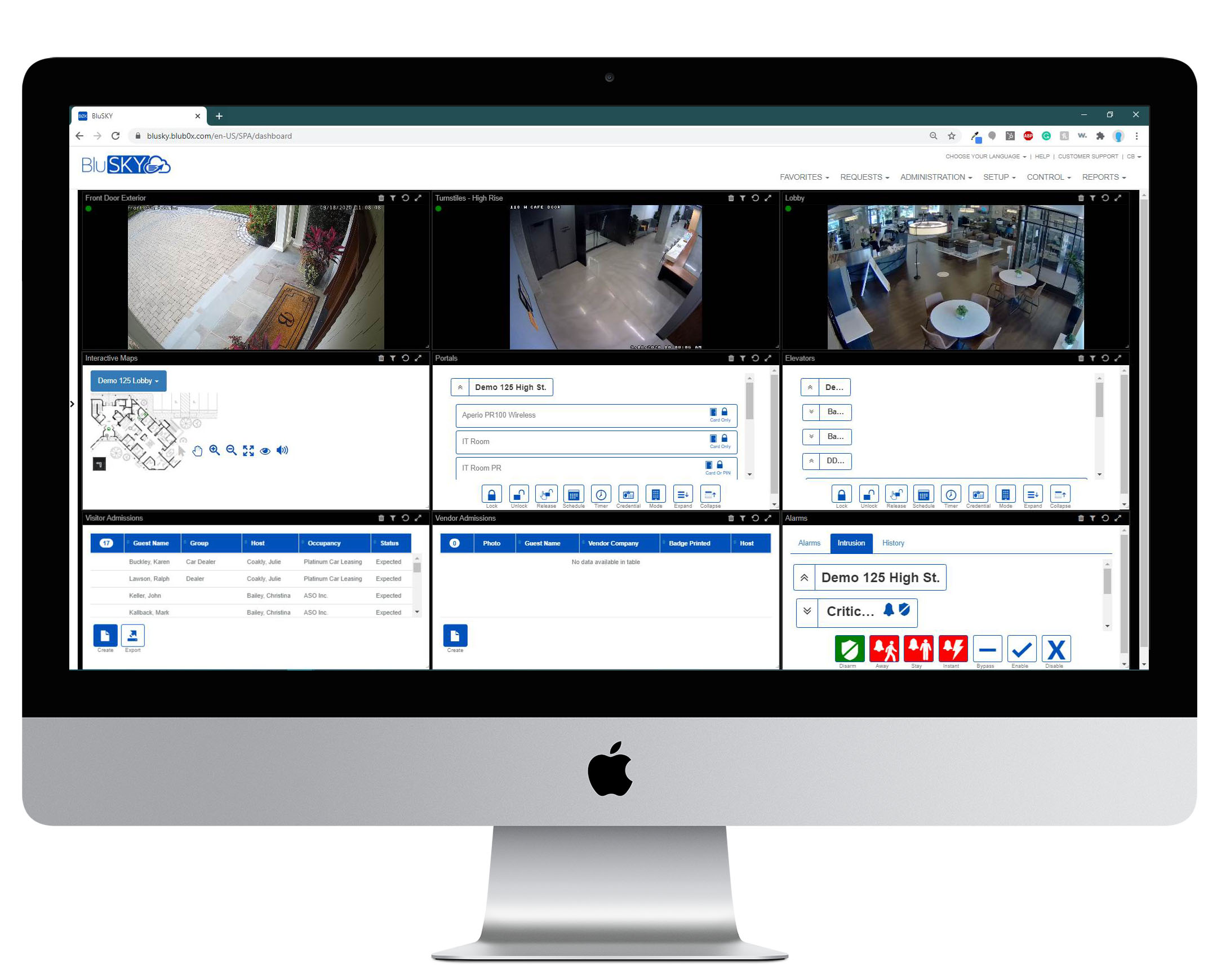
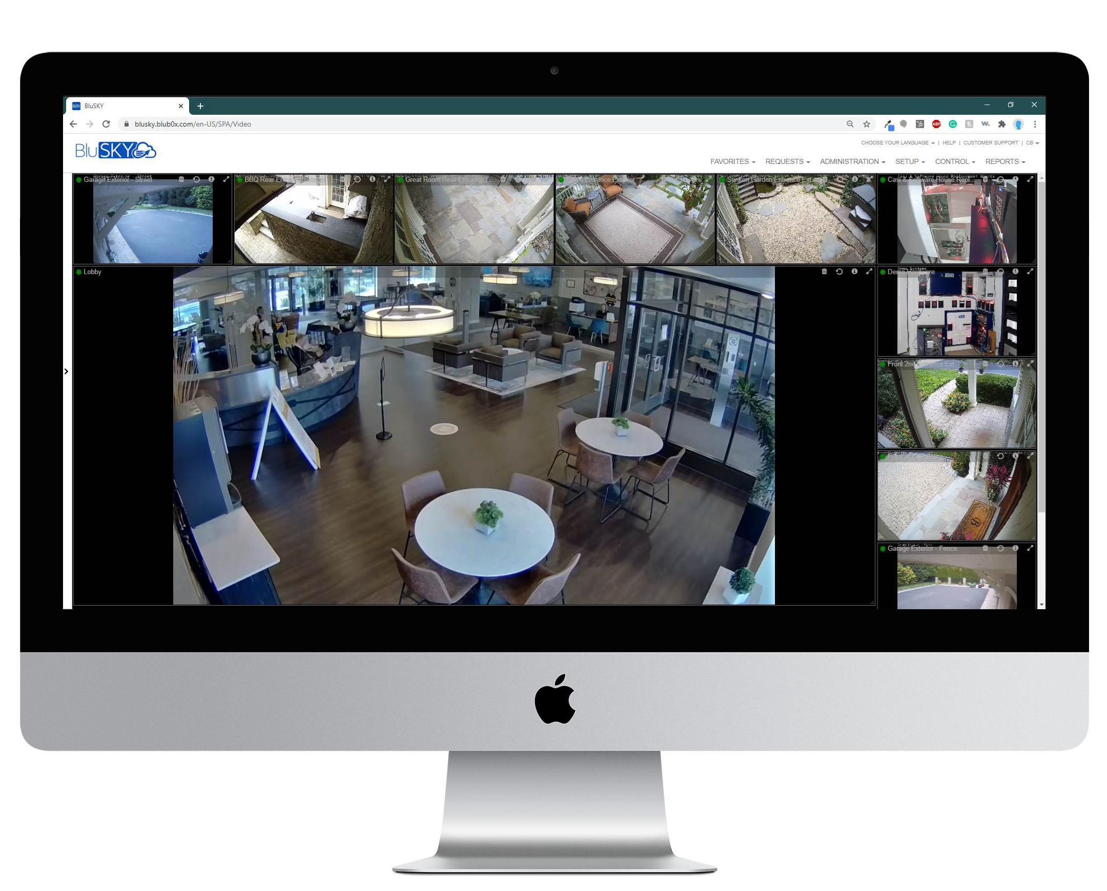
Enhancements:
Dashboard:
Interface - Changed the color scheme from blue to black headers in order to make titles more visible. When you hover the titles will turn bold and grey color. You can only drag dashlets by title.
Left Navigation - The entire look of the navigation has been enhanced with anchors in dropdown items to make it easier to navigate and to hide and expand each section.
Modules - The dropdown items are more refined. You can drag an item into the dashboard drop-in box or double click on your selection and it will automatically place it into an open area in the dashboard.
Facilities and Devices - New Search Filter provides you with the same capabilities you have in the Video module. We started off with cameras but in a later release, it will expand to all of your devices connected to BluSKY - Readers, Inputs, Control Points, and Intercoms. This will allow you to bring up devices much easier.
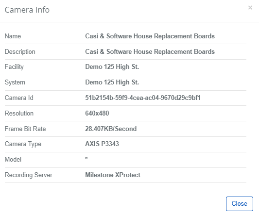
Camera Info - Click on the camera icon for each camera to get more info about the camera. You can get camera info from both the dashboard and Video modules.
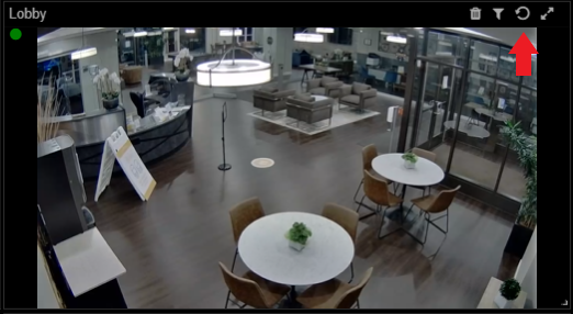
Refresh - New button shown on the top right corner of each dashlet. This allows you to refresh the specific dashlet without affecting the entire dashboard.
Layouts - Diagram icons are now on the left-hand side instead of the right so you can easily correlate the layout to what is on the dashboard. If you select any of the layouts in the dropdown it will rearrange the dashboard automatically to the selected layout the best that it can.
Clear - Clear button on the bottom navigation of the left navigation tool allows you to clear your entire dashboard and changes the dashboard to a new template automatically to allow you to start building a new dashboard quicker.

Video:
Interface - Changed the color scheme from blue to black headers in order to make titles more visible. When you hover the titles will turn bold and grey color.
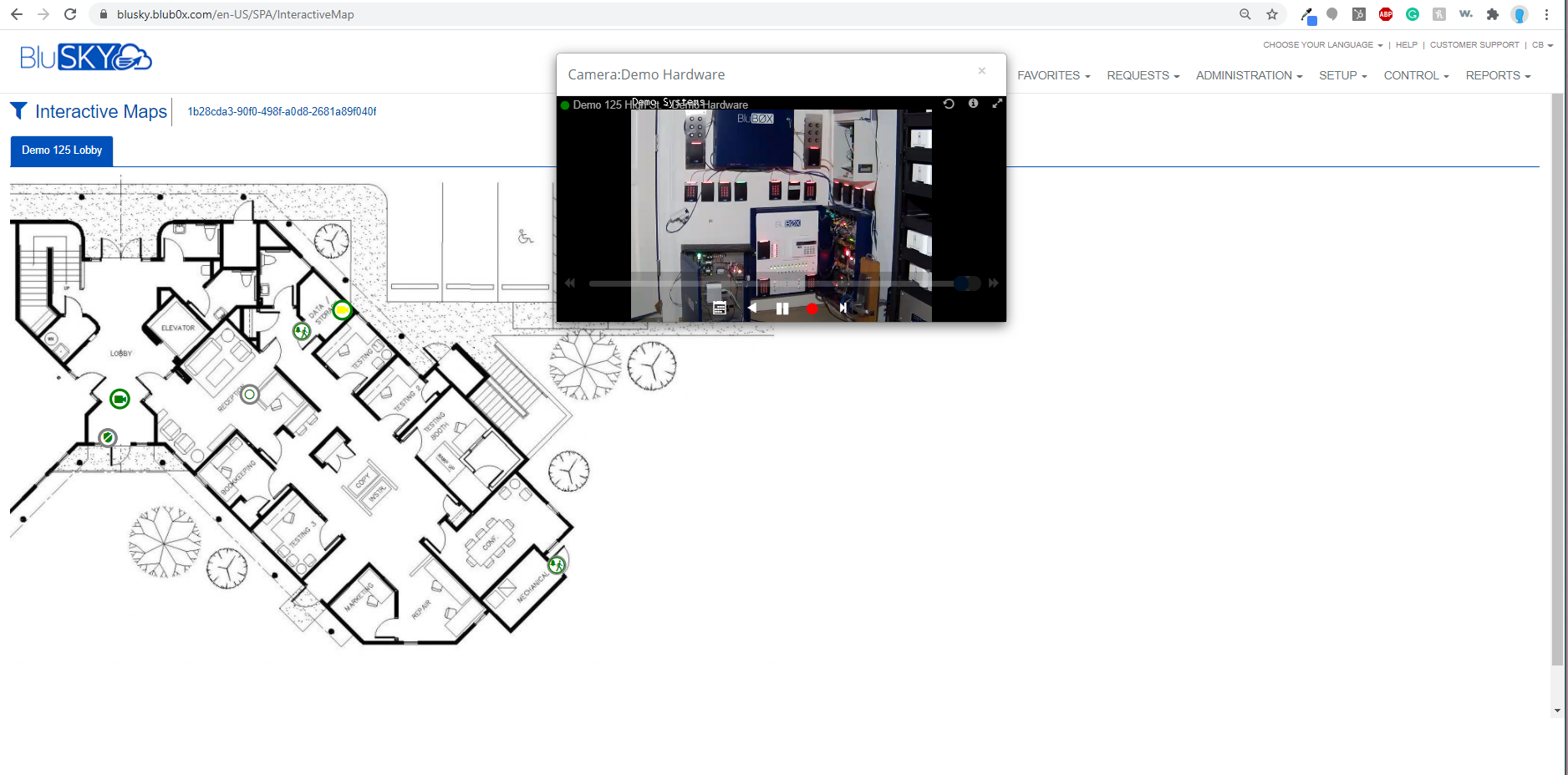
Video Playback- Video playback controls have been simplified! Video Playback flashes to indicate that it is playing back, you can save the clip and add a note for event history, pause the clip, or go back to a specific date for video playback. These features can be used on any camera on your dashboard, Interactive Maps, and the Video Module. Hover over the video to get the menu of options as shown in the image below.
Multi-Site - You can now select the total number of cameras for each system by clicking the number to the right by each site and it will select all cameras in that system automatically. This allows you to then drag them all at once onto the screen. Click on the number again will deselect all cameras.
Facilities and Devices - New Search Filter provides you with the same capabilities you have in the Video module. We started off with cameras but in a later release, it will expand to all of your devices connected to BluSKY - Readers, Inputs, Control Points, and Intercoms. This will allow you to bring up devices much easier. Expand and Collapse allows you to quickly get to all of your cameras. You can also drag an entire facility into the Video Views, which makes it easy for when you have multiple sites.
Video Events - Video clips will continually play in a loop. You have the refresh button and the camera info icons at the top right just like in Dashboard and Video module.
Fixes:
All Fixes applied in BluSKY for September were primarily performance improvements and back-end fixes that improved the User Interface.