Dashboard Old
Dashboard Screen
Screen Overview
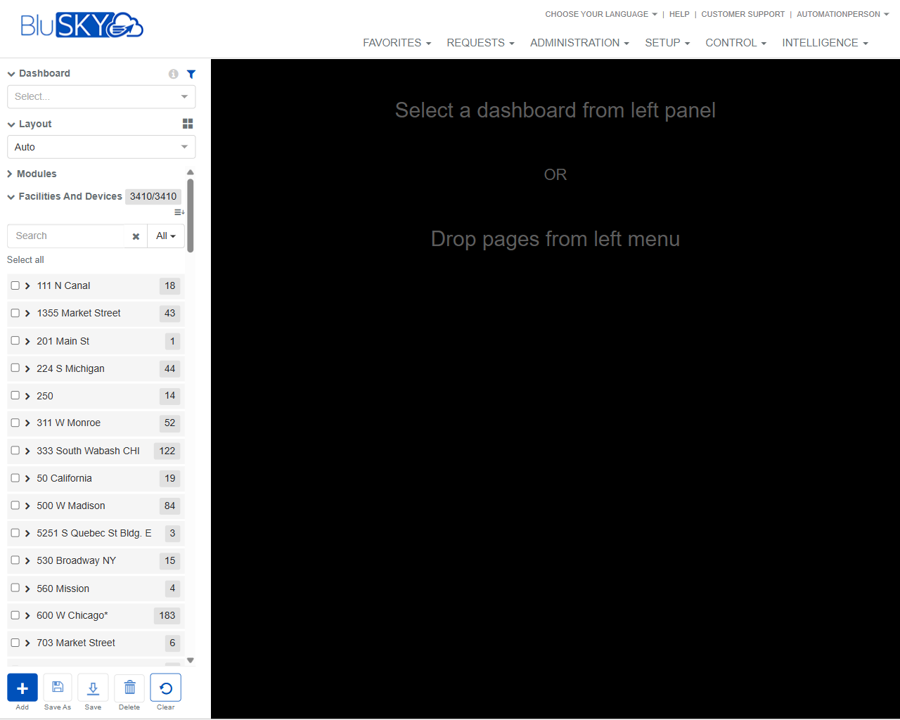
The Dashboard screen allows users to create, edit, and manage custom dashboards within BluSKY. The left panel provides controls to select a dashboard, choose a layout, and browse available modules/pages (e.g., Facilities and Devices). Users drag items from the left panel onto the canvas on the right to assemble dashboards, then save, copy, or delete them using the action bar.
Field Definitions
| Field Label | Definition | Notes |
|---|---|---|
| Dashboard | Dropdown used to select an existing dashboard to view or edit. | Shows “Select…” when no dashboard is chosen. Changing the selection loads that dashboard into the canvas. |
| Layout | Dropdown that defines how widgets/pages are arranged on the canvas. | “Auto” displays a responsive layout. Other layouts may be available based on system configuration. |
| Modules | Collapsible section listing groups of pages that can be added to a dashboard. | In the screenshot, the active group is “Facilities and Devices.” Items within Modules are drag-and-drop onto the canvas. |
| Facilities and Devices | A module group containing locations/devices organized by site. | Displays a count badge (e.g., 3410/3410) indicating available/filtered items. |
| Search | Text field that filters items within the active module group. | Filters results as you type. Works with the Filter dropdown. |
| Filter (All) | Dropdown next to Search that scopes which items are shown. | “All” displays every item that matches the current module; other options may limit types. |
| Select all | Control to select all currently filtered results in the list. | Useful for bulk selection; exact add behavior depends on drag-and-drop or context actions. |
| Facility/Site Node | A row representing a site (e.g., “111 N Canal”). | Click the chevron to expand/collapse. The numeric badge shows available items in that node. |
| Expand/Collapse | Chevron next to a node that reveals or hides its child items. | Expanded nodes display pages/widgets that can be dragged to the canvas. |
| Item Count Badge | Small pill with a number (e.g., 18, 43) to indicate how many items are under a node. | Read-only. Updates with filtering. |
| Drag-and-Drop Canvas | The large workspace on the right where selected items are placed to build the dashboard. | When empty, displays guidance: “Select a dashboard from left panel OR Drop pages from left menu.” |
Screen Actions and Functions
- Add – Creates a new, blank dashboard.
- Save As – Saves the current layout as a new dashboard (copy).
- Save – Persists changes to the currently selected dashboard.
- Delete – Removes the currently selected dashboard after confirmation.
- Clear – Clears unsaved items from the canvas or resets the current working layout.
- Drag-and-drop – Drag items from Modules onto the canvas to add them to the dashboard.
- Expand/Collapse – Reveal or hide the children under a facility/site node.
- Search and Filter – Narrow the visible items before dragging them onto the canvas.
- Select all – Selects all filtered items for bulk actions/drag.
Usage Instructions & Examples
How to build a new dashboard
- Click Add.
- If prompted, enter a dashboard name and confirm.
- Choose a Layout (e.g., Auto).
- In Modules, use Search and Filter (All) to find the desired items.
- Expand facility/site nodes as needed and drag items onto the canvas.
- Arrange items on the canvas per your layout needs.
- Click Save to store your dashboard.
How to open and edit an existing dashboard
- Use the Dashboard dropdown and select the desired dashboard.
- Review the items on the canvas and adjust the Layout if needed.
- Drag additional items from Modules onto the canvas or remove/rearrange existing items.
- Click Save to persist changes, or click Save As to create a copy.
How to quickly populate a dashboard by location
- In Modules, type a site name in Search (e.g., “Market”).
- Expand the matching facility/site node(s).
- Drag the needed pages/items from that node to the canvas.
- Click Save.
System Behaviors and Edge Cases
- The canvas displays guidance text until a dashboard is selected or an item is dropped.
- Search and Filter (All) affect only the current module group.
- Expand/Collapse state affects visibility only; it does not add or remove items from the dashboard.
- Save As creates a new dashboard record, preserving the original.
- Delete requires confirmation and removes the selected dashboard from the dropdown list.
- If you navigate away with unsaved changes, the system may prompt you to confirm leaving.
- Some items may be unavailable based on permissions; such items will not appear or cannot be added.
- Extremely large numbers of widgets can impact load and render performance on the canvas.
Permissions
- Access typically requires roles with rights to view and manage dashboards (e.g., Global Administrators, Tenant Administrators, or users granted a dashboard management permission).
- Creating or editing dashboards requires Create/Update permissions for dashboards.
- Deleting dashboards requires a Delete permission for dashboards.
- Visibility of Facilities and Devices items is governed by the user’s facility/device access rights.
Linked Workflows
- Saved dashboards can be favorited and used as quick landing pages.
- Items added from Facilities and Devices link to underlying device/facility pages used in Control and Administration workflows.
- Administrators may share dashboards with other users or groups as part of onboarding or operations workflows.
Reference Image Links